Friends & Family
May 1
11:00 AM7:00 PM
Manitou A Bi Bii Daziigae
Industry
May 2
5:00 PM9:00 PM
Manitou A Bi Bii Daziigae
Land Acknowledgement

We would like to acknowledge that we've been privileged to complete our studies on Treaty 1 territory; the traditional gathering place of the Anishinaabe, Cree, Oji-Cree, Dakota and Dene people and the traditional homeland of the Métis people.

Leslie Wiebe

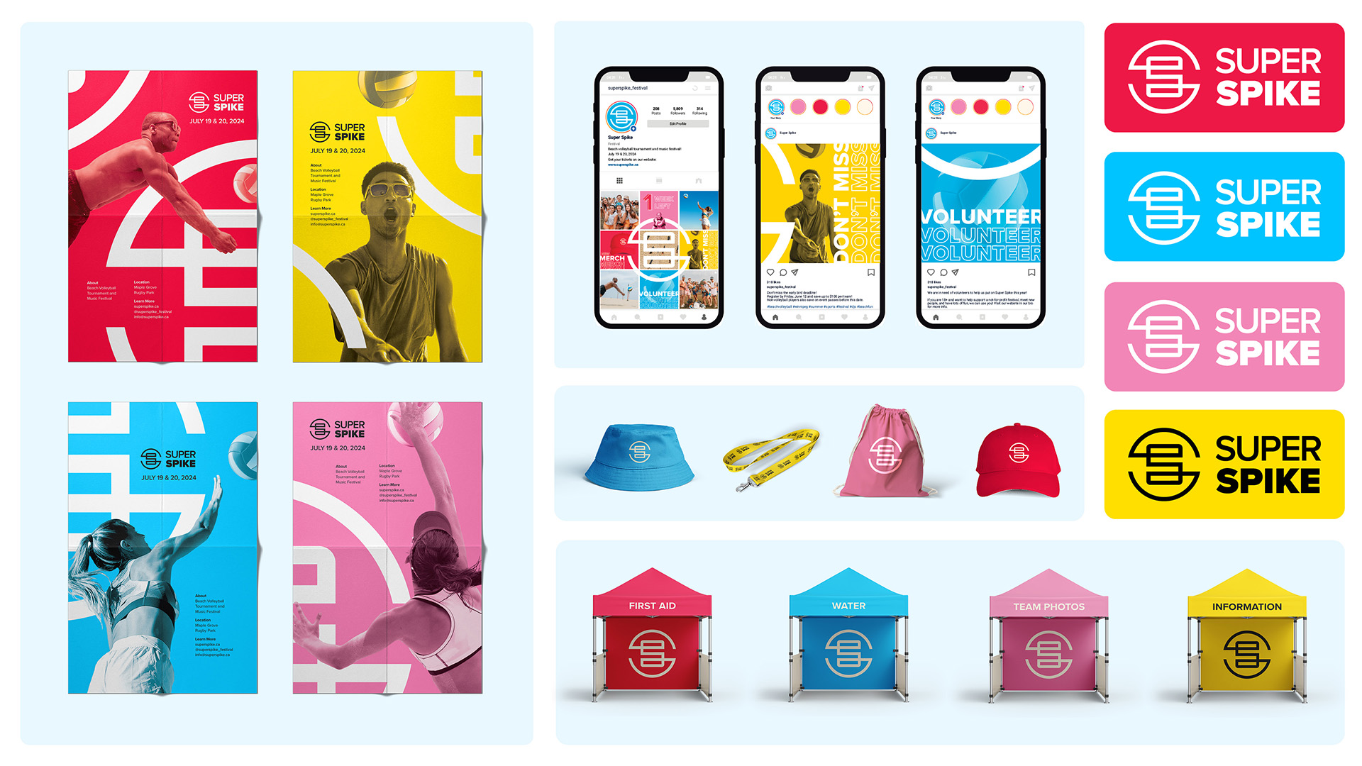
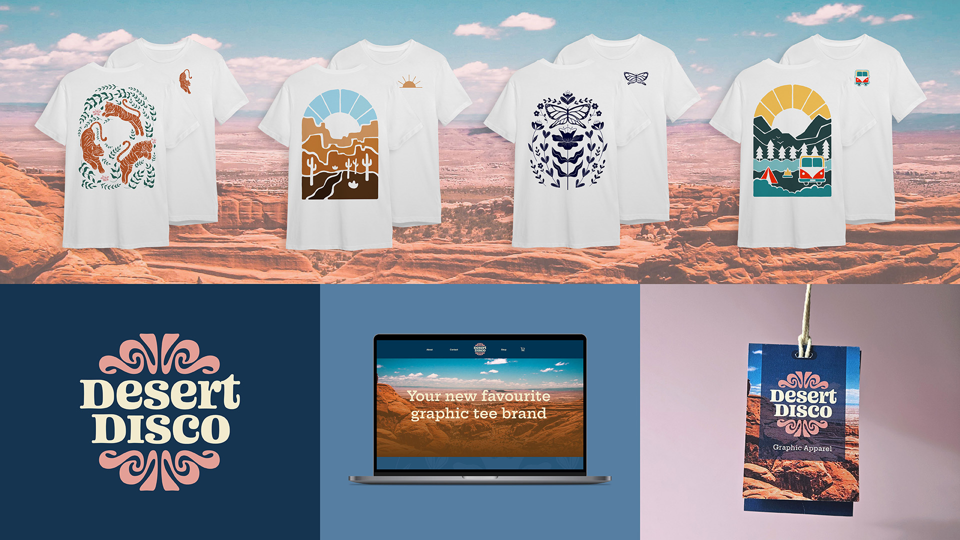
Hi, I’m Leslie! I’m passionate about bringing ideas to life through visual communication which is what keeps me excited about this field of work. I love sketching my ideas out, gathering inspiration, and then seeing where that leads. Although I enjoy all areas of design, I’m particularly drawn to working on branding and campaigns. One project I’ve really enjoyed creating this year has been a graphic tee company called Desert Disco. It is inspired by a trip I went on to Arizona and it was fun to add personal touches to the project. I love to travel when I get the chance as it always fills me with new ideas. I’m looking forward to joining the industry and applying all I’ve learned throughout this program!

Super Spike – Event Branding & Campaign

  • Branding
  • Campaign
  • Marketing
  • Social Media

Super Spike is a not-for-profit beach volleyball tournament in Manitoba that happens every summer. This project involves a new logo, branding, and social media design. The colours are bold and bright, encompassing the vibrant energy of summer. The logo contains two abstract S’s for Super Spike that wrap around each other. The Inner S is also shaped like a volleyball court. The roundness of the logo represents a volleyball. The flow and direction represent movement and forward change. The visuals on the social media page contribute to the excitement and anticipation leading up to the event.

Cinema Success – Infographic

  • Illustration

The objective of this project is to create an infographic that highlights successful aspects of cinema. The colour blue is used to emulate the effect of blue light in a dark movie theater. The film rolls in the background bring depth and extra interest. An icon glossary is added to reduce the amount of words and focus on the visual appeal. This also brings unity to the infographic. A dotted texture applied to the background gives a more authentic and retro feel to the piece.

Desert Disco – Apparel Company

  • Branding
  • Illustration
  • Product Design

Desert Disco was created when the founder was in search of a unique graphic tee that didn’t have a tacky phrase paired with the illustration. The name serves as a unique juxtaposition and is memorable, sparking intrigue with the audience. While the desert part of the name hints at nature, landscapes, and solitude, a disco party is more urban, retro, and lively. Desert Disco is the best of both worlds. The graphics on the shirts often have themes of nature and adventure, but they aren’t limited to that as each line of clothing is unique. This original brand is whimsical and modern, yet has a nostalgic, vintage flair. The colour palette is inspired by the Sedona mountains. Scenic photography on the clothing tag and website provide roots and depth to the brand.