Friends & Family
May 1
11:00 AM7:00 PM
Manitou A Bi Bii Daziigae
Industry
May 2
5:00 PM9:00 PM
Manitou A Bi Bii Daziigae
Land Acknowledgement

We would like to acknowledge that we've been privileged to complete our studies on Treaty 1 territory; the traditional gathering place of the Anishinaabe, Cree, Oji-Cree, Dakota and Dene people and the traditional homeland of the Métis people.

Alexis Gortemaker

Hey everyone, I’m Alexis :) What a crazy, incredible, entirely worthwhile ride this program has been. Not only have I had the opportunity and resources to explore and strengthen my design work, but also the chance to develop strong friendships, learn new skills, and perfect the exact ratio of caffeine/minimum sleep needed to remain functioning (life skill). I thoroughly enjoy most every aspect of design, but this year has really helped solidify my love for the branding/marketing process. Developing a meaningful visual personality from nothing more than an idea and watching it come to life just doesn’t get old! Beyond excited to be in a line of work I love, and look forward to seeing where this industry takes my classmates and I!
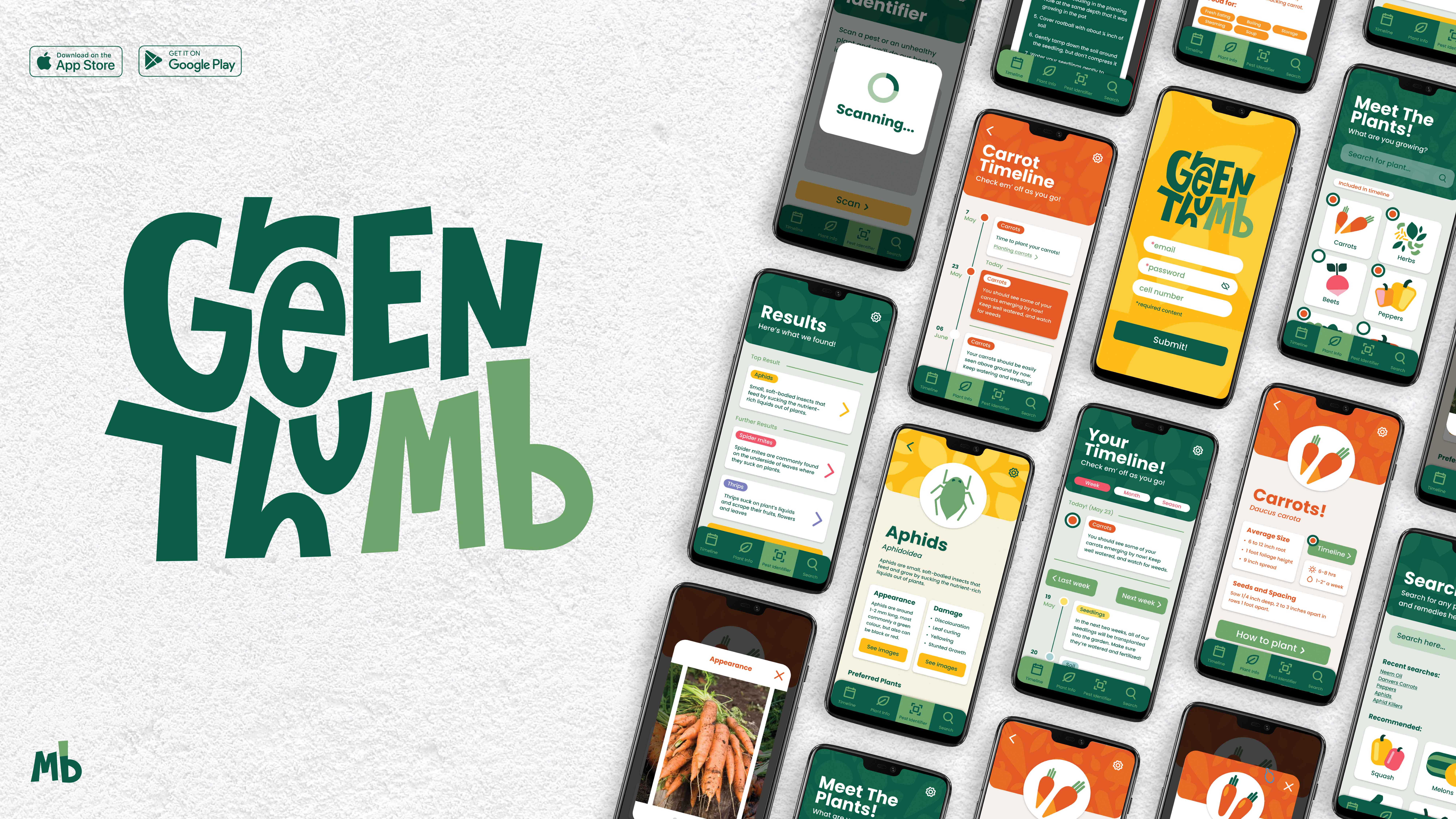
Green ThuMB

  • Branding
  • App Design
  • Illustration

Gardening in Manitoba’s particular climate can be a unique and complicated challenge. The short growing season and unpredictable extremes can be hard to factor in. Green ThuMB is a Manitoba-tailored gardening assistant designed to simplify and streamline the process of growing produce in a Manitoban climate, for gardeners of every level! 

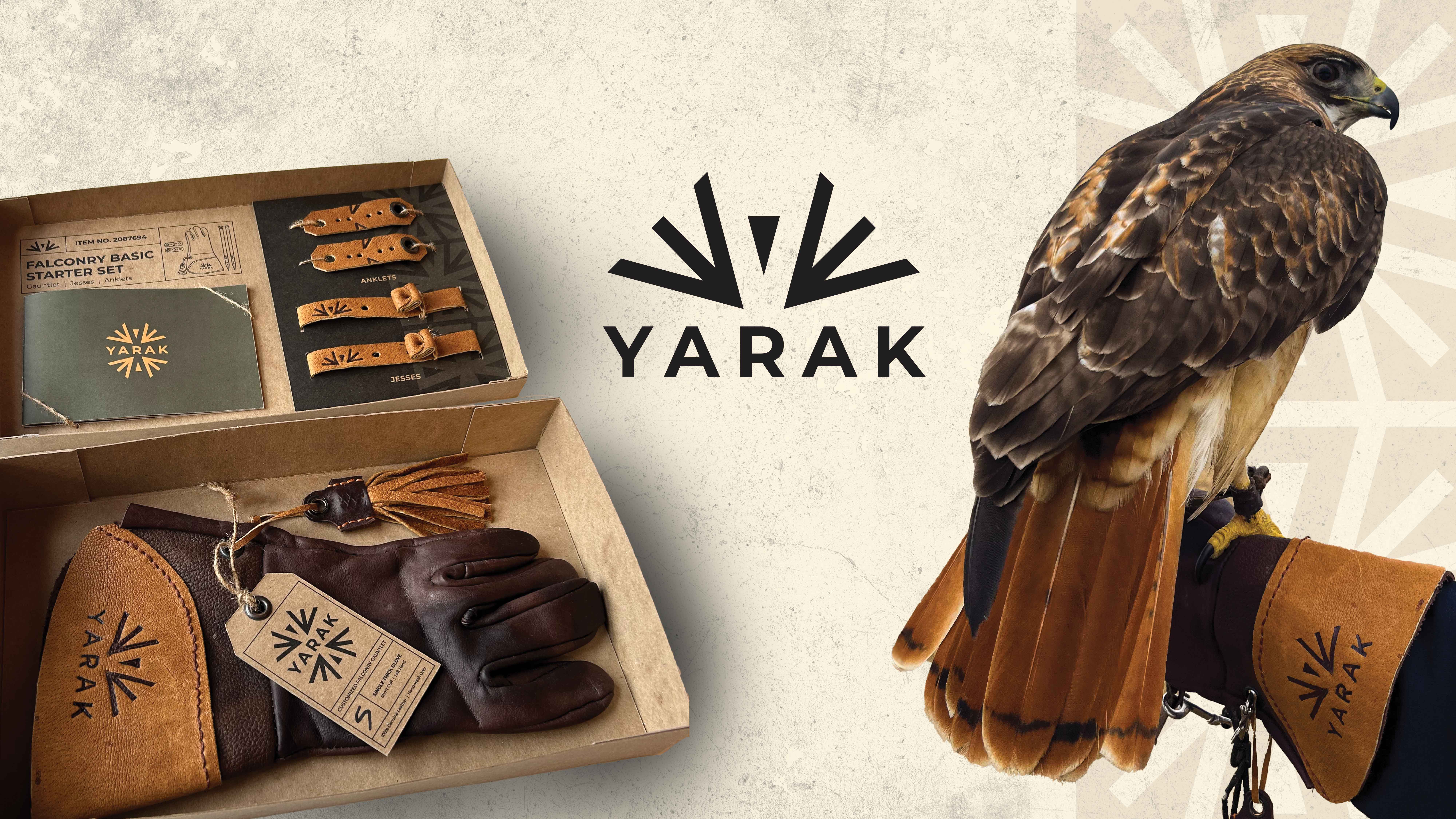
Yarak

  • Packaging
  • Branding
  • Product Design
  • Marketing

Yarak is a fictional falconry supply company. Yarak, which means ‘prime fitness, alertness, and readiness to hunt in a bird of prey,’ has the mission of supporting and equipping falconers with quality equipment in whatever stage of the falconry journey they’re in. 

HEART Diving

  • Branding
  • Web Design
  • Campaign

HEART, standing for Hutterian Emergency Aquatic Rescue Team, is a Manitoba local rescue service. This rebrand embodies and emboldens their existing brand, and ties together its mission in a concise logo mark. This rebrand was not done in affiliation with them, but purely for assignment purposes.